Readability is considered one of the most important factors in the website content. Writers use many techniques for the enhancement of readability in which the F-Shaped Pattern is trendy nowadays.
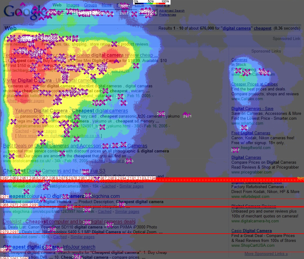
The F-Shaped Pattern is the arrangement of content in such a way that it looks like F. It has been cited that most of the readers scan the content in the f-shape pattern. The F-Pattern describes the most common user eye-scanning patterns when it comes to blocks of content. F for fast. That’s how users read your content. In a few seconds, their eyes move at amazing speeds across your website’s page.

Like the readers first, scan the first horizontal section then second horizontal section gone through the sight and at last glimpse at the vertical section of the website. The concept of the f-shaped pattern was popularized after the eye-tracking research which was experimented with over 200 readers. In this experiment, the reading pattern of the people was observed.

Why should we use it?
Understanding this pattern of website scanning is important to your business and its success. If your website layout and content do not match the F-pattern, users may waste time trying to find what they need. If they feel like they’ve wasted too much time, or that the valuable content they are looking for is impossible to easily scan, they’ll likely move to a site where scanning is easier. When you plan your content with the F-pattern in mind, you give users what they want even if they don’t know it.
The F-Shaped Pattern will assist you to create a design with good visual hierarchy, a design that people can read easily. The F-Shaped Pattern feels comfortable for most of the readers because they have been reading top to bottom, left to right as per the human psychology.
When should we use it?
The F-pattern is the go-to layout for text-containing websites like blogs and news sites. If there is a lot of content especially text users will respond better with the layout designed. Bearing the F-shaped pattern in mind will help you create a design with good visual hierarchy – a design that people can scan easily. The F-shaped layout feels comfortable for most western readers because they have been used to reading from top to bottom, left to right, for their entire lives.
How to use the F-Shaped Pattern?

F-Layout literally gives the designer more control over what gets seen. It really helps in adding more traffic to your website and to attract the readers. Consider this when incorporating the F-pattern into your content.
Setting up the Priorities:
Before arranging the elements on your page, prioritize the most and least important ones. Once you know what you want your users to see, you can simply place them rightly. Put the most important elements first. You know users will begin at the top of your page, reading across to determine what products, services, or information you are providing. Take the next most important information—or the info you want them to take away and put it a little farther down the page where you know readers will pause and look through the content more slowly.
Make things clear at the beginning:
Create website expectations. Your readers may not know you are relying on F-pattern scanning methods, but they will feel like your content gives them what they want without them having to work too hard to get it. This expectation of layout allows your users to review your website at their own speed. Moreover, the first two paragraphs are the most important. Place the most important content near to the top of the page as possible in an attempt to communicate the site’s purpose quickly.
Focus on the right placement:
The user will usually read horizontally across the header, so here’s a good place for a navigation bar. Generate engagement with your sidebar. Your sidebar can have anything in it, from related articles, links to social pages, or ads. This breaks up the content for your users and gives them something else to consider about your business while they are scanning the content on the current page.
Why People Scan in an F-shaped Pattern?
People scan in an F-shape when because of these 3 elements:
- A page includes a lot of text that has little or no formatting for the web. For example, it has a “wall of text” but no bolding, bullets, or subheadings.
- The user is trying to be most efficient on that page.
- The user is not so interested that he is willing to read every word.
The last two elements pretty much summarize all web behavior: the vast majority of the web users would rather finish their tasks as fast as possible with the minimum amount of effort; they visit a page because they want to find a quick answer rather than read a dissertation on the topic and educate themselves.
F-shaped pattern and Human psychology:

When writers and designers have not taken any steps to direct the user to the most relevant, interesting, or helpful information, users will then find their own path. In the absence of any signals to guide the eye, they will choose the path of minimum effort and will spend most of their fixations close to where they start reading (which is usually the top left-most word on a page of text).
It’s not that people will always scan the page in the shape of an F. Although years of reading have likely trained people into thinking that more important content comes before less important content, no user really feels that the content has been arranged so the most important things appear in an F shape. The F-pattern is the default pattern when there are no strong cues to attract the eyes towards meaningful information.
Summing it all,
People tend to minimize interaction costs and maximize the benefit they get from the work they do. For their eyes, this translates to spending a few fixations, while still gleaning the information they need; being productive, engaged, and successful with what they take in from those fixations. Economizing on time means fewer fixations — looking at fewer words.
In some cases, people will get bored or fatigued as they scan text. Other times, the words they read offer only a weak information scent, which may be enough gratification to continue scanning, but not enough to read more of the text.
For more such article visit our official website Webful Creations.


